Theme Configuration
INFO
The configInheritance is available from Shopware Version 6.4.8.0
Overview
This guide shows you how the theme configuration works and explains the possibilities of the settings in more depth.
Prerequisites
This guide is built upon the guide on creating a first theme:
Structure of theme configuration
The theme configuration for a theme is located in the theme.json file <plugin root>/src/Resources folder. Open up the <plugin root>/src/Resources/theme.json file with your favorite code-editor. The configuration looks like this.
// <plugin root>/src/Resources/theme.json
{
  "name": "SwagBasicExampleTheme",
  "author": "Shopware AG",
  "description": {
    "en-GB": "My custom theme",
    "de-DE": "Mein custom thema"
  },
  "views": [
     "@Storefront",
     "@Plugins",
     "@SwagBasicExampleTheme"
  ],
  "previewMedia": "app/storefront/dist/assets/defaultThemePreview.jpg",
  "style": [
    "app/storefront/src/scss/overrides.scss",
    "@Storefront",
    "app/storefront/src/scss/base.scss"
  ],
  "script": [
    "@Storefront",
    "app/storefront/dist/storefront/js/swag-basic-example-theme/swag-basic-example-theme.js"
  ],
  "asset": [
    "@Storefront",
    "app/storefront/src/assets"
  ],
  "configInheritance": [
    "@Storefront",
    "@OtherTheme"
    ]
}
INFO
If you make changes or additions to the theme.json file, you must then execute the theme:refresh command to put them into effect. Run bin/console theme:refresh in order to update your theme.
Basic Information
// <plugin root>/src/Resources/theme.json
{
  "name": "SwagBasicExampleTheme",
  "author": "Shopware AG",
  "description": {
    "en-GB": "Just another description",
    "de-DE": "Nur eine weitere Beschreibung"
  },
  ...
}
Here change the name of your theme and the author. It is recommended to choose a name in camel case. The description section is optional and as you notice it is also translatable.
The previewMedia field provides a path app/storefront/dist/assets/defaultThemePreview.jpg to an image file that is relative to the root directory of the theme. It serves as a visual preview of the theme. This preview image is typically displayed within the Shopware administration interface or theme marketplace as a thumbnail or preview of the theme's appearance to give users an idea of how the theme will appear on their storefront before they activate it.
// <plugin root>/src/Resources/theme.json
{
  ...
  "previewMedia": "app/storefront/dist/assets/defaultThemePreview.jpg",
  ...
}
Views
The views section controls the template inheritance. This will be covered in the Theme inheritance guide.
// <plugin root>/src/Resources/theme.json
{
  ...
  "views": [
     "@Storefront",
     "@Plugins",
     "@SwagBasicExampleTheme"
  ],
  ...
}
Styles
The style section determines the order of the CSS compilation. In the <plugin root>/src/Resources/app/storefront/src/scss/base.scss file you can apply your changes you want to make to the @Storefront standard styles or add other styles you need. The <plugin root>/src/Resources/app/storefront/src/scss/overrides.scss file is used for a special case. Maybe you need to override some defined variables or functions defined by Shopware or Bootstrap, you can implement your changes here. Checkout the Override bootstrap variables in a theme guide for further information.
// <plugin root>/src/Resources/theme.json
{
  ...
  "style": [
    "app/storefront/src/scss/overrides.scss",
    "@Storefront",
    "app/storefront/src/scss/base.scss"
  ],
  ...
}
You can add a full reference to other namespaces, like the @Storefront alias for the default Storefront, or other themes by referencing their technical name, like @BasicTheme. If you don't want to import all files from the whole namespace, you can also reference single files from a specific namespace. With this method you can also change the order in which these files are imported.
// <plugin root>/src/Resources/theme.json
{
  ...
  "style": [
    "app/storefront/src/scss/overrides.scss",
    "@Storefront",
    "@BasicTheme/app/storefront/src/scss/custom.scss",
    "app/storefront/src/scss/base.scss"
  ],
  ...
}
Script Files
The script section configures the order of JavaScript files that should be imported for your theme. Make sure to reference the compiled versions of your script files from the dist directory of your theme.
// <plugin root>/src/Resources/theme.json
{
  ...
  "script": [
    "@Storefront",
    "@Plugins",
    "app/storefront/dist/storefront/js/storefront-test-app-theme/storefront-test-app-theme.js"
  ],
  ...
}
Also for scripts, the namespace alias and single file reference can be used.
// <plugin root>/src/Resources/theme.json
{
  ...
  "script": [
    "@Storefront",
    "@Plugins",
    "@BasicTheme/app/storefront/dist/storefront/custom-plugin.js",
    "app/storefront/dist/storefront/js/storefront-test-app-theme/storefront-test-app-theme.js"
  ],
  ...
}
Assets
The asset option you can configure your paths to your assets like images, fonts, etc. The standard location to put your assets to is the <plugin root>/app/storefront/src/assets folder. Checkout the Add assets to theme guide for further information.
// <plugin root>/src/Resources/theme.json
{
  ...
  "asset": [
     "app/storefront/src/assets"
   ]
  ...
}
If you need the assets from the default storefront theme for your custom theme, just add @Storefront as asset path
// <plugin root>/src/Resources/theme.json
{
  ...
  "asset": [
     "@Storefront",
     "app/storefront/src/assets"
   ]
  ...
}
Config fields
One of the benefits of creating a theme is that you can overwrite the theme configuration of the default theme or add your own configurations.
// <plugin root>/src/Resources/theme.json
{
  ...
  "asset":[
    ...
  ],
  "config": {
      "fields": {
        "sw-color-brand-primary": {
          "value": "#00ff00"
        }
      }
   }
}
In the example above, we change the primary color to green. You always inherit from the storefront config and both configurations are merged. This also means that you only have to provide the values you actually want to change. You can find a more detailed explanation of the configuration inheritance in the section Theme inheritance.
WARNING
If you overwrite variables of another theme from a third party provider and these are renamed or removed at a later time, this can lead to issues and the theme can no longer be compiled. So be aware of it.
The theme.json contains a config property which contains a list of tabs, blocks, sections and fields.
The key of each config field item is also the technical name which you use to access the config option in your theme or scss files. config entries will show up in the Administration and can be customized by the end user (if editable is set to true, see table below).
The following parameters can be defined for a config field item:
| Name | Meaning |
|---|---|
label | Array of translations with locale code as key. (Deprecated for v6.8: Translations are now handled via Administration snippets) |
helpText | Array of translations with locale code as key. (Deprecated for v6.8: Translations are now handled via Administration snippets) |
type | Type of the config. Possible values: color, text, number, fontFamily, media, checkbox, switch and url |
editable | If set to false, the config option will not be displayed (e.g. in the Administration) |
tab | Name of a tab to organize the config options |
block | Name of a block to organize the config options |
section | Name of a section to organize the config options |
custom | The defined data will not be processed but is available via API |
scss | If set to false, the config option will not be injected as a SCSS variable |
fullWidth | If set to true, the Administration component width will be displayed in full width |
Translations in Theme Manager
Since the translations in theme.config are only used by the Theme Manager in the administration, we decided to use snippet keys for translating the configuration in order to ensure inheritance.
Store these snippet keys in Administration snippet files, for example, <plugin root>/src/Resources/app/administration/src/app/snippet/de.json and <plugin root>/src/Resources/app/administration/src/app/snippet/en.json. Locale-specific files such as de-DE.json and en-GB.json are also supported and override the base language files.
Each snippet key begins with sw-theme, followed by the theme’s technical name, or its respective parent theme name, since snippets are inherited from the parent theme as well. It then includes the names of the relevant tab, block, section, and field. If you're translating field options, a numeric index is added to the snippet path. If any of these elements are unnamed, default will be used as the replacement in the key.
At the end of the key, you append label. For fields, you may alternatively use helpText instead of label.
This results in the following key structure:
- Tab:
sw-theme.<technicalName>.<tabName>.label - Block:
sw-theme.<technicalName>.<tabName>.<blockName>.label - Section:
sw-theme.<technicalName>.<tabName>.<blockName>.<sectionName>.label - Field:
sw-theme.<technicalName>.<tabName>.<blockName>.<sectionName>.<fieldName>.labelsw-theme.<technicalName>.<tabName>.<blockName>.<sectionName>.<fieldName>.helpText
- Option:
sw-theme.<technicalName>.<tabName>.<blockName>.<sectionName>.<fieldName>.<index>.label
Example
Assuming your theme.json is structured as follows:
// <plugin root>/src/Resources/theme.json
{
"name": "JustAnotherTheme",
// ...
"config": {
"fields": {
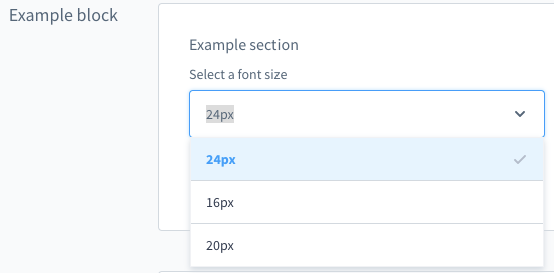
"my-single-select-field": {
"type": "text",
"value": "24",
"custom": {
"componentName": "sw-single-select",
"options": [
{
"value": "16"
},
{
"value": "20"
},
{
"value": "24"
}
]
},
"editable": true,
"block": "exampleBlock",
"section": "exampleSection"
}
}
}
}This would generate the following snippet keys:
- Tab:
sw-theme.justAnotherTheme.default.label - Block:
sw-theme.justAnotherTheme.default.exampleBlock.label - Section:
sw-theme.justAnotherTheme.default.exampleBlock.exampleSection.label - Field:
sw-theme.justAnotherTheme.default.exampleBlock.exampleSection.my-single-select-field.labelsw-theme.justAnotherTheme.default.exampleBlock.exampleSection.my-single-select-field.helpText
- Option:
sw-theme.justAnotherTheme.default.exampleBlock.exampleSection.my-single-select-field.0.labelsw-theme.justAnotherTheme.default.exampleBlock.exampleSection.my-single-select-field.1.labelsw-theme.justAnotherTheme.default.exampleBlock.exampleSection.my-single-select-field.2.label
Field types
You can use different field types in your theme manager:
A text field example:
A number field example:
Two boolean field examples:
Examples for custom config fields
A custom single-select field example
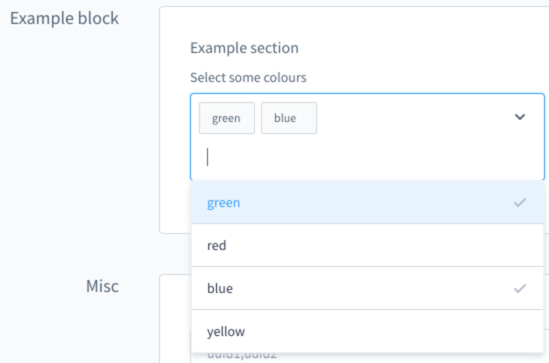
A custom multi-select field example
Tabs, blocks and sections
You can use tabs, blocks and sections to structure and group the config options.
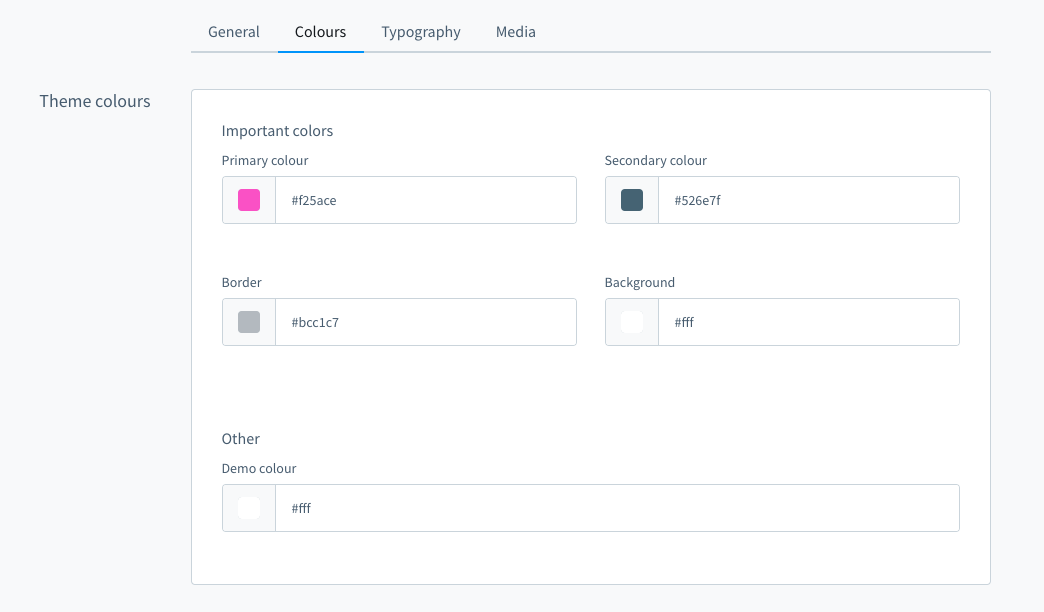
In the picture above are four tabs. In the "Colours" tab there is one block "Theme colours" which contains two sections named "Important colors" and "Other". You can define the block and section individually for each item. Example:
The tab and section property is not required.
You can extend the config to add translated labels for the tabs, blocks and sections:
Config inheritance
The configInheritance option lets you configure additional themes from which your theme will inherit its fields configuration and snippets. Every theme will always inherit the fields from the Storefront standard theme. With this option you can add additional other themes. For example, you can have a basic theme for your corporate design and special themes for different sales channels with specific changes only needed for a single sales channel.
// <plugin root>/src/Resources/theme.json
{
  ...
  "configInheritance": [
     "@Storefront",
     "@BasicTheme"
   ]
  ...
}
In this example the BasicTheme is a theme that adds all the configurations you need for your corporate design. This configurations will be inherited in your new theme which can add or change some configurations only needed in a special sales channel or for a special time. See Theme inheritance for a more detailed example.
All configuration fields and their values from the mentioned themes in configInheritance are available inside the current theme, unless they are explicitly overwritten. This way custom themes can be extended without copying their configuration inside the theme.json. The relationship of the inheritance is only created while installing the theme. For updating the relationship later on, the command theme:refresh can be used.
Next steps
Now that you know how to configure your theme, here is a list of things you can do.