Component Sections
Component sections allow extensions to render UI components inside existing Administration views. They are typically used together with tabs or other extension points that expose a positionId.
See the Component Sections concept for an overview.
componentSection.add()
Add a new component to a component section.
Usage
ts
import { ui } from '@shopware-ag/meteor-admin-sdk';

ui.componentSection.add({
    component: 'the-component', // Choose the component which you want to render at the component section
    positionId: 'the-position-id-of-the-component-section', // Select the positionId where you want to render the component
    props: {
        ... // The properties are depending on the component
    }
})
Parameters
| Name | Required | Default | Description |
|---|---|---|---|
component | true | Choose the component which you want to render. |
Return value
Returns a promise without data.
Available components
Card
Properties
| Name | Required | Default | Description |
|---|---|---|---|
title | false | The main title of the card | |
subtitle | false | The subtitle of the card | |
locationId | true | The locationId for the custom view | |
tabs | false | Render different content with tabs |
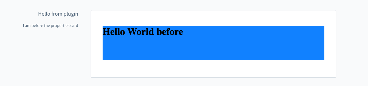
Example: Add a component to the product page
js
import { ui } from "@shopware-ag/meteor-admin-sdk";

ui.componentSection.add({
  component: "card",
  positionId: "sw-product-properties__before",
  props: {
    title: "Hello from plugin",
    subtitle: "I am before the properties card",
    locationId: "my-awesome-app-card-before",
  },
});
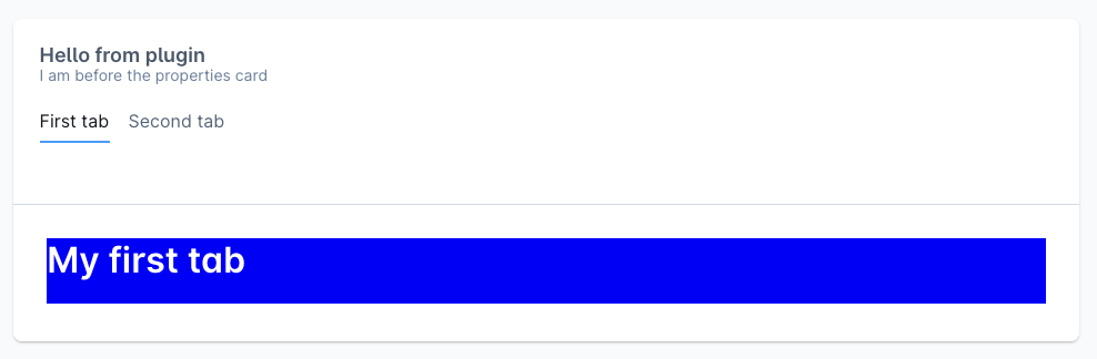
Example: Add tabs to the card
js
import { ui } from "@shopware-ag/meteor-admin-sdk";

ui.componentSection.add({
  component: "card",
  positionId: "sw-product-properties__before",
  props: {
    title: "Hello from plugin",
    subtitle: "I am before the properties card",
    locationId: "my-awesome-app-card-before",
    // Render tabs and custom tab content with the provided location id
    tabs: [
      {
        name: "example-tab-1",
        label: "First tab",
        locationId: "example-tab-1",
      },
      {
        name: "example-tab-2",
        label: "Second tab",
        locationId: "example-tab-2",
      },
    ],
  },
});
To render the tabs introduced in this example, add matching entry points in your extension code using the locationId values that you freely chose when registering the component section. Read more about this pattern in Locations.
js
import { location } from "@shopware-ag/meteor-admin-sdk";

if (location.is("example-tab-1")) {
  document.body.innerHTML = "<h1>First tab content</h1>";
}

if (location.is("example-tab-2")) {
  document.body.innerHTML = "<h1>Second tab content</h1>";
}